Android 自定义View之圆形进度条_android 圆形进度条-程序员宅基地
技术标签: 自定义View android View Android
目录
前言
很多场景下都用到这种进度条,有的还带动画效果,

今天我也来写一个。
写之前先拆解下它的组成:
- 底层圆形
- 上层弧形
- 中间文字
那我们要做的就是:
- 绘制底层圆形;
- 在同位置绘制上层弧形,但颜色不同;
- 在中心点绘制文本,显示进度。
按照这个目标,学习下自定义View的流程。
(本文用到 Canvas 相关的知识点,不熟悉的可以参考文末参考资料。)
1.基础
新建一个类,继承 View ,重写构造函数,如,
package com.test.luodemo.customerview;

import android.content.Context;
import android.util.AttributeSet;
import android.view.View;

import androidx.annotation.Nullable;

public class CircleProgressBar extends View {
    public CircleProgressBar(Context context) {
        super(context);
    }

    public CircleProgressBar(Context context, @Nullable AttributeSet attrs) {
        super(context, attrs);
    }

    public CircleProgressBar(Context context, @Nullable AttributeSet attrs, int defStyleAttr) {
        super(context, attrs, defStyleAttr);
    }
}
在 xml 中使用,LinearLayout 加了背景颜色,方便看出所在位置。
<LinearLayout
            android:layout_width="wrap_content"
            android:layout_height="wrap_content"
            android:background="@color/purple_200">
            <com.test.luodemo.customerview.CircleProgressBar
                android:layout_width="300dp"
                android:layout_height="300dp"/>
        </LinearLayout>
此时运行,是没效果的,因为这个View还没有绘制,啥也没有。
2.绘制底层圆形
初始化3个图形的画笔 ,底层圆形和上层弧形的画笔宽度一致、颜色不一致,方便区分
重写 onDraw(Canvas canvas) 方法,用 canvas.drawCircle 绘制底层圆形,
package com.test.luodemo.customerview;

import android.content.Context;
import android.graphics.Canvas;
import android.graphics.Color;
import android.graphics.Paint;
import android.util.AttributeSet;
import android.view.View;

import androidx.annotation.Nullable;

public class CircleProgressBar extends View {
    private Paint paintCircleBottom = new Paint();
    private Paint paintArcTop = new Paint();
    private Paint paintText = new Paint();

    public CircleProgressBar(Context context) {
        super(context);
        init();
    }

    public CircleProgressBar(Context context, @Nullable AttributeSet attrs) {
        super(context, attrs);
        init();
    }

    public CircleProgressBar(Context context, @Nullable AttributeSet attrs, int defStyleAttr) {
        super(context, attrs, defStyleAttr);
        init();
    }

    private void init(){
        //初始化文本的画笔
        paintText.setFlags(Paint.ANTI_ALIAS_FLAG);
        paintText.setColor(Color.BLACK);
        paintText.setTextAlign(Paint.Align.CENTER);
        paintText.setTextSize(80f);

        //初始化底层圆形的画笔
        paintCircleBottom.setFlags(Paint.ANTI_ALIAS_FLAG);
        paintCircleBottom.setColor(Color.LTGRAY);
        paintCircleBottom.setStrokeWidth(10f);
        paintCircleBottom.setStrokeCap(Paint.Cap.ROUND);
        paintCircleBottom.setStyle(Paint.Style.STROKE);

        //初始化弧形的画笔
        paintArcTop.setFlags(Paint.ANTI_ALIAS_FLAG);
        paintArcTop.setColor(Color.MAGENTA);
        paintArcTop.setStrokeWidth(10f);
        paintArcTop.setStrokeCap(Paint.Cap.ROUND);
        paintArcTop.setStyle(Paint.Style.STROKE);
    }

    @Override
    protected void onDraw(Canvas canvas) {
        super.onDraw(canvas);

        //绘制底层圆形
        canvas.drawCircle(300, 300, 200, paintCircleBottom);
    }
}
效果,

3.绘制上层弧形
在之前的基础上绘制上层弧形,弧形的中心和圆心一致。
用 canvas.drawArc 绘制弧形。这里直接指定绘制的角度是 90° ,后续会动态指定。
	@Override
    protected void onDraw(Canvas canvas) {
        super.onDraw(canvas);

        //绘制底层圆形
        canvas.drawCircle( 300, 300, 200, paintCircleBottom);

        //绘制上层弧形,从顶部开始,顺时针走90°
        _angle = 90;
        canvas.drawArc(100,100,500,500,270, _angle,false, paintArcTop);

    }
效果,

4.绘制文本
用 canvas.drawText 绘制文本,
使用 DecimalFormat 格式化输入,保留小数点后两位,如果小数点后两位都是0则不显示小数点后两位。
	@Override
    protected void onDraw(Canvas canvas) {
        super.onDraw(canvas);

        //绘制底层圆形
        canvas.drawCircle(300, 300, 200, paintCircleBottom);

        //绘制上层弧形,从顶部开始,顺时针走90°
        _angle = 90;
        canvas.drawArc(100,100,500,500,270, _angle,false, paintArcTop);

        //绘制文本
        DecimalFormat dt = new DecimalFormat("0.##");
        canvas.drawText(dt.format(100 * _angle/360)+"%", 300 , 300, paintText);
    }
效果,

可以看到,文本虽然居中,但是文本是显示在中心线上,

期望结果是文本的水平中心线和圆心重合,改为,
		//绘制文本,文字中心和圆心保持一致
        Paint.FontMetrics fontMetrics = paintText.getFontMetrics();
        float distance =(fontMetrics.bottom - fontMetrics.top)/2 - fontMetrics.bottom;
        float baseline= 300 + distance;
        canvas.drawText(dt.format(100 * _angle/360)+"%", 300, baseline, paintText);//文字中心和圆心一致
效果,符合预期。

5.添加动画
创建一个设置进度的接口,供外部调用。
使用 ValueAnimator ,监听动画过程,然后逐渐刷新角度值。使用 AccelerateInterpolator 插值器,动画速度开始慢、逐渐加速。
	@Override
    protected void onDraw(Canvas canvas) {
        super.onDraw(canvas);

        //绘制底层圆形
        canvas.drawCircle(300, 300, 200, paintCircleBottom);

        //绘制上层弧形,从顶部开始,顺时针走90°
        canvas.drawArc(100,100,500,500,270, _angle,false, paintArcTop);

        //绘制文本,文字中心和圆心保持一致
        DecimalFormat dt = new DecimalFormat("0.##");
        Paint.FontMetrics fontMetrics = paintText.getFontMetrics();
        float distance =(fontMetrics.bottom - fontMetrics.top)/2 - fontMetrics.bottom;
        float baseline= 300 + distance;
        canvas.drawText(dt.format(100 * _angle/360)+"%", 300, baseline, paintText);//文字中心和圆心一致
    }

	/**
     * 设置进度,展现动画
     * */
    public void setProgress(int progress){
        ValueAnimator animator = ValueAnimator.ofFloat(0,100f);
        animator.addUpdateListener(new ValueAnimator.AnimatorUpdateListener() {
            @Override
            public void onAnimationUpdate(ValueAnimator animation) {
                float cur = (float) animation.getAnimatedValue();
                _angle = cur/100 * 360 * progress/100;
                invalidate(); //刷新 View
            }
        });
        animator.setDuration(3000);
        animator.setInterpolator(new AccelerateInterpolator());
        animator.start();
    }
注意要去掉 3.绘制上层弧形 中固定90°的逻辑。
外部调用,
CircleProgressBar mCircleProgressBar1 = (CircleProgressBar) findViewById(R.id.circle_progress_bar1);
mCircleProgressBar1.setProgress((int) (100 * Math.random()));
随机生成一个 0.0 - 0.1 的数值,乘以 100 设置为进度。
效果,

可以看到动画效果, 虽然 git 丢帧了 ~ 。
6.调整位置、宽高
前文我是设定了 View 宽高都是 300dp ,并且绘制图形是随意指定的坐标。
实际开发时,不可能用这些值,所以要优化下绘制的逻辑。
实际使用时,可能宽度高度一样,宽度大于高度 ,宽度小于高度,
采用这个逻辑:
- 取宽度、高度的最小值,作为圆的直径,除以 2 得到半径。
- 对角线交汇点作为圆心。
简言之,以对角线为圆心画最大内切圆。
重写 onMeasure 方法,重绘 View 的宽高,这部分参考《Android 开发艺术探索》,
	private int DEFAULT_WIDTH = 100;//默认宽度
    private int DEFAULT_HEIGHT = 100;//默认宽度
    private int DEFAULT_RADIUS = 50;//默认半径

	@Override
    protected void onMeasure(int widthMeasureSpec, int heightMeasureSpec) {
        super.onMeasure(widthMeasureSpec, heightMeasureSpec);

        int widthMode = MeasureSpec.getMode(widthMeasureSpec);
        int heightMode = MeasureSpec.getMode(heightMeasureSpec);

        if (widthMode == MeasureSpec.AT_MOST && heightMode == MeasureSpec.AT_MOST) {
            setMeasuredDimension(DEFAULT_WIDTH, DEFAULT_HEIGHT);
        } else if (widthMode == MeasureSpec.AT_MOST) {
            setMeasuredDimension(DEFAULT_WIDTH, heightMeasureSpec);
        } else if (heightMode == MeasureSpec.AT_MOST) {
            setMeasuredDimension(widthMeasureSpec, DEFAULT_HEIGHT);
        }
    }
修改 onDraw 绘制逻辑 ,
	@Override
    protected void onDraw(Canvas canvas) {
        super.onDraw(canvas);

        // 圆心坐标是(centerX,centerY)
        int centerX = getWidth()/2;
        int centerY = getHeight()/2;
        //确定半径
        float radius = Math.min(centerX, centerY) - paintCircleBottom.getStrokeWidth();


        //绘制底层圆形
        canvas.drawCircle(centerX, centerY, radius, paintCircleBottom);


        //绘制上层弧形,从顶部开始,顺时针走 _angle
        canvas.drawArc(centerX - radius,centerY-radius,centerX + radius,centerY + radius,270, _angle,false, paintArcTop);

        //绘制文本,文字中心和圆心保持一致
        Paint.FontMetrics fontMetrics = paintText.getFontMetrics();
        float distance =(fontMetrics.bottom - fontMetrics.top)/2 - fontMetrics.bottom;
        float baseline= centerY + distance;
        canvas.drawText(dt.format(100 * _angle/360)+"%", centerX, baseline, paintText);//文字中心和圆心一致
    }
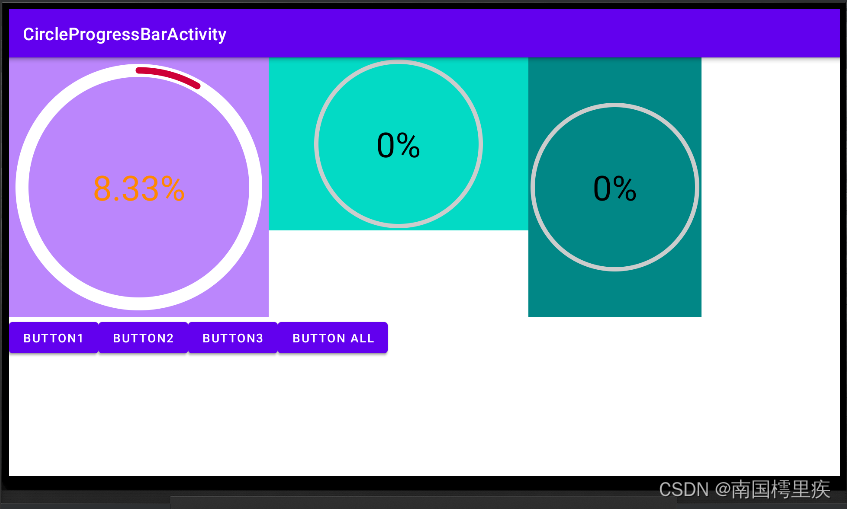
分别写了 3 个布局,布局依次是 宽度等于高度 、宽度大宇高度、宽度小于高度,效果,

至此,基本是一个还可以的版本了。
附代码
贴下当前代码,
CircleProgressBar.java
package com.test.luodemo.customerview;

import android.animation.ValueAnimator;
import android.content.Context;
import android.graphics.Canvas;
import android.graphics.Color;
import android.graphics.Paint;
import android.util.AttributeSet;
import android.util.Log;
import android.view.View;
import android.view.animation.AccelerateInterpolator;

import androidx.annotation.Nullable;

import java.text.DecimalFormat;

public class CircleProgressBar extends View {
    private Paint paintCircleBottom = new Paint();
    private Paint paintArcTop = new Paint();
    private Paint paintText = new Paint();

    private int DEFAULT_WIDTH = 100;//默认宽度
    private int DEFAULT_HEIGHT = 100;//默认宽度
    private int DEFAULT_RADIUS = 50;//默认半径

    private float _angle;//弧形的角度

    public CircleProgressBar(Context context) {
        super(context);
        init();
    }

    public CircleProgressBar(Context context, @Nullable AttributeSet attrs) {
        super(context, attrs);
        init();
    }

    public CircleProgressBar(Context context, @Nullable AttributeSet attrs, int defStyleAttr) {
        super(context, attrs, defStyleAttr);
        init();
    }

    private void init(){
        //初始化文本的画笔
        paintText.setFlags(Paint.ANTI_ALIAS_FLAG);
        paintText.setColor(Color.BLACK);
        paintText.setTextAlign(Paint.Align.CENTER);
        paintText.setTextSize(80f);

        //初始化底层圆形的画笔
        paintCircleBottom.setFlags(Paint.ANTI_ALIAS_FLAG);
        paintCircleBottom.setColor(Color.LTGRAY);
        paintCircleBottom.setStrokeWidth(10f);
        paintCircleBottom.setStrokeCap(Paint.Cap.ROUND);
        paintCircleBottom.setStyle(Paint.Style.STROKE);

        //初始化弧形的画笔
        paintArcTop.setFlags(Paint.ANTI_ALIAS_FLAG);
        paintArcTop.setColor(Color.MAGENTA);
        paintArcTop.setStrokeWidth(10f);
        paintArcTop.setStrokeCap(Paint.Cap.ROUND);
        paintArcTop.setStyle(Paint.Style.STROKE);
    }

    @Override
    protected void onMeasure(int widthMeasureSpec, int heightMeasureSpec) {
        super.onMeasure(widthMeasureSpec, heightMeasureSpec);

        int widthMode = MeasureSpec.getMode(widthMeasureSpec);
        int heightMode = MeasureSpec.getMode(heightMeasureSpec);

        if (widthMode == MeasureSpec.AT_MOST && heightMode == MeasureSpec.AT_MOST) {
            setMeasuredDimension(DEFAULT_WIDTH, DEFAULT_HEIGHT);
        } else if (widthMode == MeasureSpec.AT_MOST) {
            setMeasuredDimension(DEFAULT_WIDTH, heightMeasureSpec);
        } else if (heightMode == MeasureSpec.AT_MOST) {
            setMeasuredDimension(widthMeasureSpec, DEFAULT_HEIGHT);
        }
    }

    @Override
    protected void onDraw(Canvas canvas) {
        super.onDraw(canvas);

        // 圆心坐标是(centerX,centerY)
        int centerX = getWidth()/2;
        int centerY = getHeight()/2;
        //确定半径
        float radius = Math.min(centerX, centerY) - paintCircleBottom.getStrokeWidth();


        //绘制底层圆形
        canvas.drawCircle(centerX, centerY, radius, paintCircleBottom);


        //绘制上层弧形,从顶部开始,顺时针走90°
        canvas.drawArc(centerX - radius,centerY-radius,centerX + radius,centerY + radius,270, _angle,false, paintArcTop);

        //绘制文本,文字中心和圆心保持一致
        DecimalFormat dt = new DecimalFormat("0.##");
        Paint.FontMetrics fontMetrics = paintText.getFontMetrics();
        float distance =(fontMetrics.bottom - fontMetrics.top)/2 - fontMetrics.bottom;
        float baseline= centerY + distance;
        canvas.drawText(dt.format(100 * _angle/360)+"%", centerX, baseline, paintText);//文字中心和圆心一致
    }

    /**
     * 设置进度,展现动画
     * */
    public void setProgress(int progress){
        ValueAnimator animator = ValueAnimator.ofFloat(0,100f);
        animator.addUpdateListener(new ValueAnimator.AnimatorUpdateListener() {
            @Override
            public void onAnimationUpdate(ValueAnimator animation) {
                float cur = (float) animation.getAnimatedValue();
                _angle = cur/100 * 360 * progress/100;
                invalidate();
            }
        });
        animator.setDuration(3000);
        animator.setInterpolator(new AccelerateInterpolator());
        animator.start();
    }
}
布局文件
<?xml version="1.0" encoding="utf-8"?>
<LinearLayout xmlns:android="http://schemas.android.com/apk/res/android"
    xmlns:app="http://schemas.android.com/apk/res-auto"
    xmlns:tools="http://schemas.android.com/tools"
    android:layout_width="match_parent"
    android:layout_height="match_parent"
    android:orientation="vertical"
    tools:context=".customerview.CircleProgressBarActivity">

    <LinearLayout
        android:layout_width="match_parent"
        android:layout_height="wrap_content"
        android:orientation="horizontal">

        <LinearLayout
            android:layout_width="wrap_content"
            android:layout_height="wrap_content"
            android:background="@color/purple_200">

            <com.test.luodemo.customerview.CircleProgressBar
                android:id="@+id/circle_progress_bar1"
                android:layout_width="300dp"
                android:layout_height="300dp" />
        </LinearLayout>

        <LinearLayout
            android:layout_width="wrap_content"
            android:layout_height="wrap_content"
            android:background="@color/teal_200">

            <com.test.luodemo.customerview.CircleProgressBar
                android:id="@+id/circle_progress_bar2"
                android:layout_width="300dp"
                android:layout_height="200dp" />
        </LinearLayout>

        <LinearLayout
            android:layout_width="wrap_content"
            android:layout_height="wrap_content"
            android:background="@color/teal_700">

            <com.test.luodemo.customerview.CircleProgressBar
                android:id="@+id/circle_progress_bar3"
                android:layout_width="200dp"
                android:layout_height="300dp" />
        </LinearLayout>

        <!--<LinearLayout
            android:layout_width="50dp"
            android:layout_height="70dp"
            android:background="@color/purple_200">
            <com.test.luodemo.customerview.CircleProgressBar
                android:layout_width="match_parent"
                android:layout_height="match_parent"/>
        </LinearLayout>

        <LinearLayout
            android:layout_width="wrap_content"
            android:layout_height="wrap_content"
            android:background="@color/purple_200">
            <com.test.luodemo.customerview.CircleProgressBar
                android:layout_width="wrap_content"
                android:layout_height="wrap_content"/>
        </LinearLayout>-->
    </LinearLayout>

    <LinearLayout
        android:layout_width="match_parent"
        android:layout_height="wrap_content"
        android:visibility="visible">

        <Button
            android:id="@+id/button_cpb1"
            android:layout_width="wrap_content"
            android:layout_height="wrap_content"
            android:onClick="onCPBButtonClick"
            android:text="Button1" />

        <Button
            android:id="@+id/button_cpb2"
            android:layout_width="wrap_content"
            android:layout_height="wrap_content"
            android:onClick="onCPBButtonClick"
            android:text="Button2" />

        <Button
            android:id="@+id/button_cpb3"
            android:layout_width="wrap_content"
            android:layout_height="wrap_content"
            android:onClick="onCPBButtonClick"
            android:text="Button3" />

        <Button
            android:id="@+id/button_cpb_all"
            android:layout_width="wrap_content"
            android:layout_height="wrap_content"
            android:onClick="onCPBButtonClick"
            android:text="Button All" />
    </LinearLayout>

</LinearLayout>
Activity 调用
public class CircleProgressBarActivity extends AppCompatActivity {

    private CircleProgressBar mCircleProgressBar1 , mCircleProgressBar2 , mCircleProgressBar3;

    @Override
    protected void onCreate(Bundle savedInstanceState) {
        super.onCreate(savedInstanceState);
        setContentView(R.layout.activity_circle_progress_bar);
        Objects.requireNonNull(getSupportActionBar()).setTitle("CircleProgressBarActivity");

        mCircleProgressBar1 = (CircleProgressBar) findViewById(R.id.circle_progress_bar1);
        mCircleProgressBar2 = (CircleProgressBar) findViewById(R.id.circle_progress_bar2);
        mCircleProgressBar3 = (CircleProgressBar) findViewById(R.id.circle_progress_bar3);
    }

    public void onCPBButtonClick(View view) {
        switch (view.getId()) {
            case R.id.button_cpb1:
                mCircleProgressBar1.setProgress((int) (100 * Math.random()));
                break;
            case R.id.button_cpb2:
                mCircleProgressBar2.setProgress((int) (100 * Math.random()));
                break;
            case R.id.button_cpb3:
                mCircleProgressBar3.setProgress((int) (100 * Math.random()));
                break;
            case R.id.button_cpb_all:
                mCircleProgressBar1.setProgress((int) (100 * Math.random()));
                mCircleProgressBar2.setProgress((int) (100 * Math.random()));
                mCircleProgressBar3.setProgress((int) (100 * Math.random()));
                break;
            default:
                break;
        }
    }
}
7.自定义属性 attr
需求是不停的,会有这些需求:可指定画笔(宽度、颜色等)、可指定动画时长等。
这些可以通过在自定义的View中创建 Java 接口来设置,但我要学自定义View,就要用 attr 。
7.1 创建 res/values/attrs.xml
如果已有就不用创建,直接用就行了。
写入如下内容,
<?xml version="1.0" encoding="utf-8"?>
<resources>
    <!-- 圆形进度条 -->
    <declare-styleable name="CircleProgressBar">
        <attr name="circleWidth" format="float" /> <!--底层圆形宽度-->
        <attr name="circleColor" format="color" /> <!--底层圆形颜色-->
        <attr name="arcWidth" format="float" /> <!--上层弧形宽度-->
        <attr name="arcColor" format="color" /><!--上层弧形颜色-->
        <attr name="textColor" format="color" /><!--文本颜色-->
        <attr name="textSize" format="float" /><!--文本字体大小-->
        <attr name="initProgress" format="integer" /><!--进度-->
    </declare-styleable>
</resources>
<declare-styleable name="CircleProgressBar"> 中 CircleProgressBar 就是自定义 View 的名字,要保持一致。
不一致AS会报黄,
By convention, the custom view (CircleProgressBar) and the declare-styleable (CircleProgressBar111) should have the same name (various editor features rely on this convention)
<attr name="circleWidth" format="float" /> 是 CircleProgressBar 的属性,可指定类型
| 类型 | 说明 |
|---|---|
| boolean | 布尔类型,true 或 false |
| color | 颜色值,如 @android:color/white |
| dimension | dp 值,如 20dp |
| enum | 枚举 |
| flags | 位或运算,如 app:cus_view_gravity=“top|right” |
| fraction | 百分比,如 30% |
| float | float 型 |
| integer | int 型 |
| reference | 引用资源,如 @drawable/pic |
| string | 字符串 |
7.2 使用 TypedArray 获取 attrs
在构造函数中,通过 TypedArray 获取自定义的属性。基本逻辑就是有设置 attr 就用设置的值,没有就用默认值。
使用后一定要调用 TypedArray.recycle();
	public CircleProgressBar(Context context, @Nullable AttributeSet attrs) {
        super(context, attrs);

        TypedArray typedArray = context.obtainStyledAttributes(attrs, R.styleable.CircleProgressBar);
        textColor = typedArray.getColor(R.styleable.CircleProgressBar_textColor, Color.BLACK);
        textSize = typedArray.getFloat(R.styleable.CircleProgressBar_textSize, 80f);
        circleColor = typedArray.getColor(R.styleable.CircleProgressBar_circleColor, Color.LTGRAY);
        circleWidth = typedArray.getFloat(R.styleable.CircleProgressBar_circleWidth, 10f);
        arcColor = typedArray.getColor(R.styleable.CircleProgressBar_arcColor, Color.MAGENTA);
        arcWidth = typedArray.getFloat(R.styleable.CircleProgressBar_arcWidth, 10f);
        progress = typedArray.getInt(R.styleable.CircleProgressBar_initProgress, 0);
        typedArray.recycle();

        init();
    }
有两个带 AttributeSet 参数的构造函数,
- public CircleProgressBar(Context context, @Nullable AttributeSet attrs) {}
- public CircleProgressBar(Context context, @Nullable AttributeSet attrs, int defStyleAttr) {}
为什么用前面这个? 因为我们是在 xml 中定义的 CircleProgressBar 。参考源码说明,
	/**
     * Constructor that is called when inflating a view from XML. This is called
     * when a view is being constructed from an XML file, supplying attributes
     * that were specified in the XML file. This version uses a default style of
     * 0, so the only attribute values applied are those in the Context's Theme
     * and the given AttributeSet.
     *
     * <p>
     * The method onFinishInflate() will be called after all children have been
     * added.
     *
     * @param context The Context the view is running in, through which it can
     *        access the current theme, resources, etc.
     * @param attrs The attributes of the XML tag that is inflating the view.
     * @see #View(Context, AttributeSet, int)
     */
    public View(Context context, @Nullable AttributeSet attrs) {
        this(context, attrs, 0);
    }

    /**
     * Perform inflation from XML and apply a class-specific base style from a
     * theme attribute. This constructor of View allows subclasses to use their
     * own base style when they are inflating. For example, a Button class's
     * constructor would call this version of the super class constructor and
     * supply <code>R.attr.buttonStyle</code> for <var>defStyleAttr</var>; this
     * allows the theme's button style to modify all of the base view attributes
     * (in particular its background) as well as the Button class's attributes.
     *
     * @param context The Context the view is running in, through which it can
     *        access the current theme, resources, etc.
     * @param attrs The attributes of the XML tag that is inflating the view.
     * @param defStyleAttr An attribute in the current theme that contains a
     *        reference to a style resource that supplies default values for
     *        the view. Can be 0 to not look for defaults.
     * @see #View(Context, AttributeSet)
     */
    public View(Context context, @Nullable AttributeSet attrs, int defStyleAttr) {
        this(context, attrs, defStyleAttr, 0);
    }
7.3 在 xml 中初始化 attr
xml 关键代码如下,
<LinearLayout xmlns:android="http://schemas.android.com/apk/res/android"
    xmlns:app="http://schemas.android.com/apk/res-auto" <!-- 注释1-->
    xmlns:tools="http://schemas.android.com/tools"
    android:layout_width="match_parent"
    android:layout_height="match_parent"
    android:orientation="vertical"
    tools:context=".customerview.CircleProgressBarActivity">

	<!-- ... -->

	<LinearLayout
            android:layout_width="wrap_content"
            android:layout_height="wrap_content"
            android:background="@color/purple_200">

            <com.test.luodemo.customerview.CircleProgressBar
                android:id="@+id/circle_progress_bar1"
                android:layout_width="300dp"
                android:layout_height="300dp"
                <!-- 注释2-->
                app:circleColor="@android:color/white"
                app:circleWidth="30"
                app:arcColor="@color/my_red"
                app:arcWidth="15"
                app:textColor="@android:color/holo_orange_dark"
                app:initProgress="30"
                <!-- 注释2-->
                />
        </LinearLayout>
		<!-- ... -->
</LinearLayout>
注释2处就是初始化 attr ,以 app: 开头是对应注释1处。
7.4 效果
左一是自定义 attr 的效果,左二、左三是没有自定义 attr 的效果。
差异有:底层圆形的颜色、画笔大小;上层弧形的颜色、画笔大小、开始的角度;中间文字的颜色。
说明自定义 attr 起效了。
附代码V2
CircleProgressBar.java
package com.test.luodemo.customerview;

import android.animation.ValueAnimator;
import android.content.Context;
import android.content.res.TypedArray;
import android.graphics.Canvas;
import android.graphics.Color;
import android.graphics.Paint;
import android.util.AttributeSet;
import android.util.Log;
import android.view.View;
import android.view.animation.AccelerateInterpolator;

import androidx.annotation.Nullable;

import com.test.luodemo.R;

import java.text.DecimalFormat;

public class CircleProgressBar extends View {
    private Paint paintCircleBottom = new Paint();
    private Paint paintArcTop = new Paint();
    private Paint paintText = new Paint();

    private int DEFAULT_WIDTH = 100;//默认宽度
    private int DEFAULT_HEIGHT = 100;//默认宽度
    private int DEFAULT_RADIUS = 50;//默认半径

    private float _angle;//弧形的角度

    /***************************** attr *******************************/
    int textColor;
    float textSize;
    int circleColor ;
    int arcColor;
    float circleWidth;
    float arcWidth;
    int progress;
    /***************************** attr *******************************/

    public CircleProgressBar(Context context) {
        super(context);
        init();
    }

    public CircleProgressBar(Context context, @Nullable AttributeSet attrs) {
        super(context, attrs);

        TypedArray typedArray = context.obtainStyledAttributes(attrs, R.styleable.CircleProgressBar);
        textColor = typedArray.getColor(R.styleable.CircleProgressBar_textColor, Color.BLACK);
        textSize = typedArray.getFloat(R.styleable.CircleProgressBar_textSize, 80f);
        circleColor = typedArray.getColor(R.styleable.CircleProgressBar_circleColor, Color.LTGRAY);
        circleWidth = typedArray.getFloat(R.styleable.CircleProgressBar_circleWidth, 10f);
        arcColor = typedArray.getColor(R.styleable.CircleProgressBar_arcColor, Color.MAGENTA);
        arcWidth = typedArray.getFloat(R.styleable.CircleProgressBar_arcWidth, 10f);
        progress = typedArray.getInt(R.styleable.CircleProgressBar_initProgress, 0);

        typedArray.recycle();
        init();
    }

    public CircleProgressBar(Context context, @Nullable AttributeSet attrs, int defStyleAttr) {
        super(context, attrs, defStyleAttr);
        init();
    }

    private void init(){
        //初始化文本的画笔
        paintText.setFlags(Paint.ANTI_ALIAS_FLAG);
        paintText.setStyle(Paint.Style.FILL);
        paintText.setColor(textColor);//设置自定义属性值
        paintText.setTextAlign(Paint.Align.CENTER);
        paintText.setTextSize(textSize);

        //初始化底层圆形的画笔
        paintCircleBottom.setFlags(Paint.ANTI_ALIAS_FLAG);
        paintCircleBottom.setStrokeCap(Paint.Cap.ROUND);
        paintCircleBottom.setStyle(Paint.Style.STROKE);
        paintCircleBottom.setColor(circleColor);//设置自定义属性值
        paintCircleBottom.setStrokeWidth(circleWidth);//设置自定义属性值

        //初始化弧形的画笔
        paintArcTop.setFlags(Paint.ANTI_ALIAS_FLAG);
        paintArcTop.setStrokeCap(Paint.Cap.ROUND);
        paintArcTop.setStyle(Paint.Style.STROKE);
        paintArcTop.setColor(arcColor);//设置自定义属性值
        paintArcTop.setStrokeWidth(arcWidth);//设置自定义属性值

        _angle = progress;
    }

    @Override
    protected void onMeasure(int widthMeasureSpec, int heightMeasureSpec) {
        super.onMeasure(widthMeasureSpec, heightMeasureSpec);

        int widthMode = MeasureSpec.getMode(widthMeasureSpec);
        int heightMode = MeasureSpec.getMode(heightMeasureSpec);

        if (widthMode == MeasureSpec.AT_MOST && heightMode == MeasureSpec.AT_MOST) {
            setMeasuredDimension(DEFAULT_WIDTH, DEFAULT_HEIGHT);
        } else if (widthMode == MeasureSpec.AT_MOST) {
            setMeasuredDimension(DEFAULT_WIDTH, heightMeasureSpec);
        } else if (heightMode == MeasureSpec.AT_MOST) {
            setMeasuredDimension(widthMeasureSpec, DEFAULT_HEIGHT);
        }
    }

    @Override
    protected void onDraw(Canvas canvas) {
        super.onDraw(canvas);

        // 圆心坐标是(centerX,centerY)
        int centerX = getWidth()/2;
        int centerY = getHeight()/2;
        //确定半径
        float radius = Math.min(centerX, centerY) - paintCircleBottom.getStrokeWidth();

        //绘制底层圆形
        canvas.drawCircle(centerX, centerY, radius, paintCircleBottom);

        //绘制上层弧形,从顶部开始,顺时针走90°
        canvas.drawArc(centerX - radius,centerY-radius,centerX + radius,centerY + radius,270, _angle,false, paintArcTop);

        //绘制文本,文字中心和圆心保持一致
        DecimalFormat dt = new DecimalFormat("0.##");
        Paint.FontMetrics fontMetrics = paintText.getFontMetrics();
        float distance =(fontMetrics.bottom - fontMetrics.top)/2 - fontMetrics.bottom;
        float baseline= centerY + distance;
        canvas.drawText(dt.format(100 * _angle/360)+"%", centerX, baseline, paintText);//文字中心和圆心一致
    }

    /**
     * 设置进度,展现动画
     * */
    public void setProgress(int progress){
        ValueAnimator animator = ValueAnimator.ofFloat(0,100f);
        animator.addUpdateListener(new ValueAnimator.AnimatorUpdateListener() {
            @Override
            public void onAnimationUpdate(ValueAnimator animation) {
                float cur = (float) animation.getAnimatedValue();
                _angle = cur/100 * 360 * progress/100;
                invalidate();
            }
        });
        animator.setDuration(3000);
        animator.setInterpolator(new AccelerateInterpolator());
        animator.start();
    }
}
布局文件
<?xml version="1.0" encoding="utf-8"?>
<LinearLayout xmlns:android="http://schemas.android.com/apk/res/android"
    xmlns:app="http://schemas.android.com/apk/res-auto"
    xmlns:tools="http://schemas.android.com/tools"
    android:layout_width="match_parent"
    android:layout_height="match_parent"
    android:orientation="vertical"
    tools:context=".customerview.CircleProgressBarActivity">

    <LinearLayout
        android:layout_width="match_parent"
        android:layout_height="wrap_content"
        android:orientation="horizontal">

        <LinearLayout
            android:layout_width="wrap_content"
            android:layout_height="wrap_content"
            android:background="@color/purple_200">

            <com.test.luodemo.customerview.CircleProgressBar
                android:id="@+id/circle_progress_bar1"
                android:layout_width="300dp"
                android:layout_height="300dp"
                app:circleColor="@android:color/white"
                app:circleWidth="30"
                app:arcColor="@color/my_red"
                app:arcWidth="15"
                app:textColor="@android:color/holo_orange_dark"
                app:initProgress="30"
                />
        </LinearLayout>

        <LinearLayout
            android:layout_width="wrap_content"
            android:layout_height="wrap_content"
            android:background="@color/teal_200">

            <com.test.luodemo.customerview.CircleProgressBar
                android:id="@+id/circle_progress_bar2"
                android:layout_width="300dp"
                android:layout_height="200dp" />
        </LinearLayout>

        <LinearLayout
            android:layout_width="wrap_content"
            android:layout_height="wrap_content"
            android:background="@color/teal_700">

            <com.test.luodemo.customerview.CircleProgressBar
                android:id="@+id/circle_progress_bar3"
                android:layout_width="200dp"
                android:layout_height="300dp" />
        </LinearLayout>

    </LinearLayout>

    <LinearLayout
        android:layout_width="match_parent"
        android:layout_height="wrap_content"
        android:visibility="visible">

        <Button
            android:id="@+id/button_cpb1"
            android:layout_width="wrap_content"
            android:layout_height="wrap_content"
            android:onClick="onCPBButtonClick"
            android:text="Button1" />

        <Button
            android:id="@+id/button_cpb2"
            android:layout_width="wrap_content"
            android:layout_height="wrap_content"
            android:onClick="onCPBButtonClick"
            android:text="Button2" />

        <Button
            android:id="@+id/button_cpb3"
            android:layout_width="wrap_content"
            android:layout_height="wrap_content"
            android:onClick="onCPBButtonClick"
            android:text="Button3" />

        <Button
            android:id="@+id/button_cpb_all"
            android:layout_width="wrap_content"
            android:layout_height="wrap_content"
            android:onClick="onCPBButtonClick"
            android:text="Button All" />
    </LinearLayout>

</LinearLayout>
Activity 调用
和之前一样。
attrs
<?xml version="1.0" encoding="utf-8"?>
<resources>
    <!-- 圆形进度条 -->
    <declare-styleable name="CircleProgressBar">
        <attr name="circleWidth" format="float" /> <!--底层圆形宽度-->
        <attr name="circleColor" format="color" /> <!--底层圆形颜色-->
        <attr name="arcWidth" format="float" /> <!--上层弧形宽度-->
        <attr name="arcColor" format="color" /><!--上层弧形颜色-->
        <attr name="textColor" format="color" /><!--文本颜色-->
        <attr name="textSize" format="float" /><!--文本字体大小-->
        <attr name="initProgress" format="integer" /><!--进度-->
    </declare-styleable>
</resources>
8.进度条按照进度变色
继续整,进度条按照的进度,从红色渐变为黄色再渐变为绿色。
渐变就考虑用 Shader ,它专注于颜色渐变。
	@Override
    protected void onDraw(Canvas canvas) {
        super.onDraw(canvas);

        // 圆心坐标是(centerX,centerY)
        int centerX = getWidth()/2;
        int centerY = getHeight()/2;
        //确定半径
        float radius = Math.min(centerX, centerY) - paintCircleBottom.getStrokeWidth();

        //绘制底层圆形
        canvas.drawCircle(centerX, centerY, radius, paintCircleBottom);

		//注释1
        canvas.save();//保存画布状态
        canvas.rotate(-90, centerX, centerY);//以 (centerX, centerY) 为中心,逆时针旋转 90°

		//注释2
        SweepGradient sweepGradient = new SweepGradient(centerX,centerY,new int[]{Color.RED,Color.YELLOW, Color.GREEN},null);
        paintArcTop.setShader(sweepGradient);//
        paintArcTop.setStrokeCap(Paint.Cap.BUTT);//设置画笔边缘为切面,默认是半圆状

        //绘制上层弧形,从顶部开始,顺时针走90°
		// canvas.drawArc(centerX - radius,centerY-radius,centerX + radius,centerY + radius,270, _angle,false, paintArcTop);

		canvas.drawArc(centerX - radius,centerY-radius,centerX + radius,centerY + radius,0, _angle,false, paintArcTop);//注释3
        canvas.restore();//注释4

        //绘制文本,文字中心和圆心保持一致
        DecimalFormat dt = new DecimalFormat("0.##");
        Paint.FontMetrics fontMetrics = paintText.getFontMetrics();
        float distance =(fontMetrics.bottom - fontMetrics.top)/2 - fontMetrics.bottom;
        float baseline= centerY + distance;
        canvas.drawText(dt.format(100 * _angle/360)+"%", centerX, baseline, paintText);//文字中心和圆心一致
    }
-
注释1处:保存画布状态,已绘制的图形正常显示;以 (centerX, centerY) 为中心,逆时针旋转 90° ,此操作修改了画布的坐标,修改后 x轴和 y 轴的情况是这样的,

-
注释2处:创建 SweepGradient (梯度渐变,也称之为扫描式渐变,其效果有点类似雷达的扫描效果,从 3点钟方向顺时针旋转回到 3 点钟方向),画笔设置 Shader 为 SweepGradient ,设置 Shader 后画笔颜色就失效了,以 Shader 为准;画笔边缘设置为切边状(默认是半圆状),不设置的话颜色交汇处会有重叠。
-
注释3处:因为画布坐标系变了,所以 drawArc() 方法中的 startAngle 参数变了。
-
注释4处:还原对画布的修改,本例就是还原旋转画布的操作,坐标系恢复为原始状态。
效果如图,gif 失真看颜色不清晰了 =.=|

参考资料:
Android属性动画深入分析:让你成为动画牛人_singwhatiwanna的博客-程序员宅基地
Android Canvas的使用_南国樗里疾的博客-程序员宅基地
Android Canvas的drawText()和文字居中方案 - 简书
自定义控件其实很简单1/3_AigeStudio的博客-程序员宅基地
关于Android Paint.Cap枚举和Paint.Join枚举的使用_5hand的博客-程序员宅基地
智能推荐
海康威视网络摄像头开发流程(五)------- 直播页面测试_ezuikit 测试的url-程序员宅基地
文章浏览阅读3.8k次。1、将下载好的萤石js插件,添加到SoringBoot项目中。位置可参考下图所示。(容易出错的地方,在将js插件在html页面引入时,发生路径错误的问题)所以如果对页面中引入js的路径不清楚,可参考下图所示存放路径。2、将ezuikit.js引入到demo-live.html中。(可直接将如下代码复制到你创建的html页面中)<!DOCTYPE html><html lan..._ezuikit 测试的url
如何确定组态王与多动能RTU的通信方式_组态王ua-程序员宅基地
文章浏览阅读322次。第二步,在弹出的对话框选择,设备驱动—>PLC—>莫迪康—>ModbusRTU—>COM,根据配置软件选择的协议选期期,这里以此为例,然后点击“下一步”。第四步,把使用虚拟串口打勾(GPRS设备),根据需要选择要生成虚拟口,这里以选择KVCOM1为例,然后点击“下一步”设备ID即Modbus地址(1-255) 使用DTU时,为下485接口上的设备地址。第六步,Modbus的从机地址,与配置软件相同,这里以1为例,点击“下一步“第五步,Modbus的从机地址,与配置软件相同,这里以1为例,点击“下一步“_组态王ua
npm超详细安装(包括配置环境变量)!!!npm安装教程(node.js安装教程)_npm安装配置-程序员宅基地
文章浏览阅读9.4k次,点赞22次,收藏19次。安装npm相当于安装node.js,Node.js已自带npm,安装Node.js时会一起安装,npm的作用就是对Node.js依赖的包进行管理,也可以理解为用来安装/卸载Node.js需要装的东西_npm安装配置
火车头采集器AI伪原创【php源码】-程序员宅基地
文章浏览阅读748次,点赞21次,收藏26次。大家好,小编来为大家解答以下问题,python基础训练100题,python入门100例题,现在让我们一起来看看吧!宝子们还在新手村练级的时候,不单要吸入基础知识,夯实自己的理论基础,还要去实际操作练练手啊!由于文章篇幅限制,不可能将100道题全部呈现在此除了这些,下面还有我整理好的基础入门学习资料,视频和讲解文案都很齐全,用来入门绝对靠谱,需要的自提。保证100%免费这不,贴心的我爆肝给大家整理了这份今天给大家分享100道Python练习题。大家一定要给我三连啊~
Linux Ubuntu 安装 Sublime Text (无法使用 wget 命令,使用安装包下载)_ubuntu 安装sumlime text打不开-程序员宅基地
文章浏览阅读1k次。 为了在 Linux ( Ubuntu) 上安装sublime,一般大家都会选择常见的教程或是 sublime 官网教程,然而在国内这种方法可能失效。为此,需要用安装包安装。以下就是使用官网安装包安装的教程。打开 sublime 官网后,点击右上角 download, 或是直接访问点击打开链接,即可看到各个平台上的安装包。选择 Linux 64 位版并下载。下载后,打开终端,进入安装..._ubuntu 安装sumlime text打不开
CrossOver for Mac 2024无需安装 Windows 即可以在 Mac 上运行游戏 Mac运行exe程序和游戏 CrossOver虚拟机 crossover运行免安装游戏包-程序员宅基地
文章浏览阅读563次,点赞13次,收藏6次。CrossOver24是一款类虚拟机软件,专为macOS和Linux用户设计。它的核心技术是Wine,这是一种在Linux和macOS等非Windows操作系统上运行Windows应用程序的开源软件。通过CrossOver24,用户可以在不购买Windows授权或使用传统虚拟机的情况下,直接在Mac或Linux系统上运行Windows软件和游戏。该软件还提供了丰富的功能,如自动配置、无缝集成和实时传输等,以实现高效的跨平台操作体验。
随便推点
一个用聊天的方式让ChatGPT写的线程安全的环形List_为什么gpt一写list就卡-程序员宅基地
文章浏览阅读1.7k次。一个用聊天的方式让ChatGPT帮我写的线程安全的环形List_为什么gpt一写list就卡
Tomcat自带的设置编码Filter-程序员宅基地
文章浏览阅读336次。我们在前面的文章里曾写过Web应用中乱码产生的原因和处理方式,旧文回顾:深度揭秘乱码问题背后的原因及解决方式其中我们提到可以通过Filter的方式来设置请求和响应的encoding,来解..._filterconfig selectencoding
javascript中encodeURI和decodeURI方法使用介绍_js encodeur decodeurl-程序员宅基地
文章浏览阅读651次。转自:http://www.jb51.net/article/36480.htmencodeURI和decodeURI是成对来使用的,因为浏览器的地址栏有中文字符的话,可以会出现不可预期的错误,所以可以encodeURI把非英文字符转化为英文编码,decodeURI可以用来把字符还原回来_js encodeur decodeurl
Android开发——打包apk遇到The destination folder does not exist or is not writeable-程序员宅基地
文章浏览阅读1.9w次,点赞6次,收藏3次。前言在日常的Android开发当中,我们肯定要打包apk。但是今天我打包的时候遇到一个很奇怪的问题Android The destination folder does not exist or is not writeable,大意是目标文件夹不存在或不可写。出现问题的原因以及解决办法上面有说报错的中文大意是:目标文件夹不存在或不可写。其实问题就在我们的打包界面当中图中标红的Desti..._the destination folder does not exist or is not writeable
Eclipse配置高大上环境-程序员宅基地
文章浏览阅读94次。一、配置代码编辑区的样式 <1>打开Eclipse,Help —> Install NewSoftware,界面如下: <2>点击add...,按下图所示操作: name:随意填写,Location:http://eclipse-color-th..._ecplise高大上设置
Linux安装MySQL-5.6.24-1.linux_glibc2.5.x86_64.rpm-bundle.tar_linux mysql 安装 mysql-5.6.24-1.linux_glibc2.5.x86_6-程序员宅基地
文章浏览阅读2.8k次。一,下载mysql:http://dev.mysql.com/downloads/mysql/; 打开页面之后,在Select Platform:下选择linux Generic,如果没有出现Linux的选项,请换一个浏览器试试。我用的谷歌版本不可以,换一个别的浏览器就行了,如果还是不行,需要换一个翻墙的浏览器。 二,下载完后解压缩并放到安装文件夹下: 1、MySQL-client-5.6.2_linux mysql 安装 mysql-5.6.24-1.linux_glibc2.5.x86_64.rpm-bundle